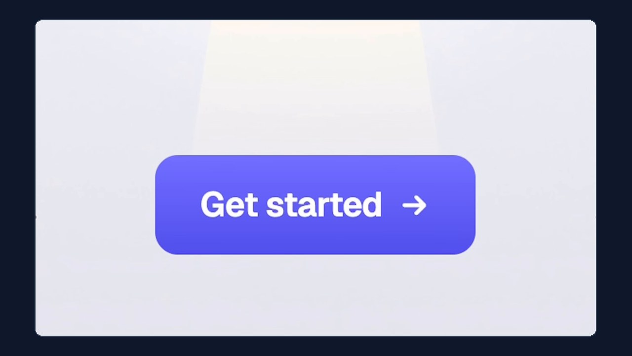
Make Your Buttons Look Premium with 4 Box Shadows
- Skill level
- Beginner
- Time to implement
- 15 min
- Cost
- Free
- Platform
- Outcomes
- Saves time
- Last verified
- Nov 14, 2026
Ania Kubow
Original strategy by Ania Kubow. Watch the original on Instagram.
Summary
Put your call-to-action button next to one from a premium SaaS site and yours can look flat, even with the same color and the same corner radius. The difference is light. Premium buttons look lit from above, and you can fake that with four stacked CSS box shadows, a gentle gradient, and a pressed state that turns the highlight off. It takes a few lines of CSS and works on any site where you can add custom CSS.
Set upWhat you need
A website or landing page where you can edit CSS (your theme's custom CSS box, a page builder's custom code field, or your codebase)
Your button's brand color as a hex code (the reel uses
#5b5bf0)The MDN box-shadow reference if you want to tweak values
About 15 minutes
Do thisStep by step
- 1
Add a 1px top highlight
The first layer is not a shadow at all, it is light: an inset one pixel highlight on the top edge where the light hits. In the reel it is
inset 0 1px 0 #ffffff59(white at about 35% opacity). - 2
Add a darker bottom edge
The second layer is an inset darker line along the bottom, the side facing away from the light:
inset 0 -2px 0 #0003(black at about 20% opacity). - 3
Add a tight contact shadow
The third layer is a small, dark shadow right underneath, where the button touches the page:
0 1px 2px #0006. - 4
Add a soft glow in the button's own color
The fourth layer is a big, soft glow in the button's color, like light bouncing off it:
0 8px 24px -6px #5b5bf099. Swap5b5bf0for your brand hex and keep the99at the end for transparency. Combined, the reel's full rule is:box-shadow: inset 0 1px 0 #ffffff59, inset 0 -2px 0 #0003, 0 1px 2px #0006, 0 8px 24px -6px #5b5bf099; - 5
Add a gentle top-to-bottom gradient
The reel adds a subtle gradient so the top looks lighter than the bottom. Reel Playbooks addition: the exact gradient values are not shown in the video; a safe starting point is
background: linear-gradient(180deg, #6b6bf5, #5b5bf0);, making the top stop just a few shades lighter than your base color. - 6
Flip it on press
When the button is pressed, remove the highlight so it looks pushed in. The reel shows the pressed state as
inset 0 2px 4px. Reel Playbooks addition: a full version is.btn:active { box-shadow: inset 0 2px 4px #0003; }(the shadow color is our assumption, since the reel does not show it).
Heads upCommon mistakes & tips
Reel Playbooks addition: keep text contrast readable on the gradient; check it with the free WebAIM Contrast Checker.
Reel Playbooks addition: add a visible keyboard focus style with
:focus-visible(for example an outline ring) so the polish does not hurt accessibility.Reel Playbooks addition: add
transition: box-shadow 120ms ease, transform 120ms ease;so the press feels smooth rather than jumpy.On dark backgrounds, raise the glow opacity a little and lower the bottom edge darkness, or the effect disappears.
Using an AI coding tool? Paste the shadow rule and ask it to apply the same treatment to your primary button component only, not every button on the site.
Do not overdo it. Use this on your main call to action so it stands out, not on every link.
MeasureHow to know it worked
Put your old and new buttons side by side: the new one should look slightly raised and lit from above, with a faint colored glow underneath, and should visibly sink when clicked. Reel Playbooks addition: if you want proof that it helps, run a simple A/B test on your main call to action; the reel makes a design claim, not a conversion claim, and we have not verified any impact on clicks.
ProvenanceSource & adaptation notes
Original
The reel shows why buttons look cheap next to premium SaaS buttons with the same color and radius: the difference is light. It gives four box shadow layers (top inset highlight, bottom inset darker line, tight contact shadow, big soft glow in the button's color) with exact values on screen, then says to add a gentle top-to-bottom gradient and flip it on press so the highlight disappears. The caption adds no steps and no written source is linked.
Reel Playbooks additions
Reel Playbooks additions: gradient starting values and the pressed state shadow color (not shown in the reel), contrast and focus accessibility tips, a transition for smoother presses, dark background adjustments, an AI tool tip, and the note that the reel makes no verified conversion claim.
AttributionCredit
Original tip by Ania Kubow (@aniakubow) on Instagram (watch the original reel).
Adapted from @aniakubow's video; steps expanded by Reel Playbooks.
Reel Playbooks credits and links to the original creator. See For creators to request changes or removal.