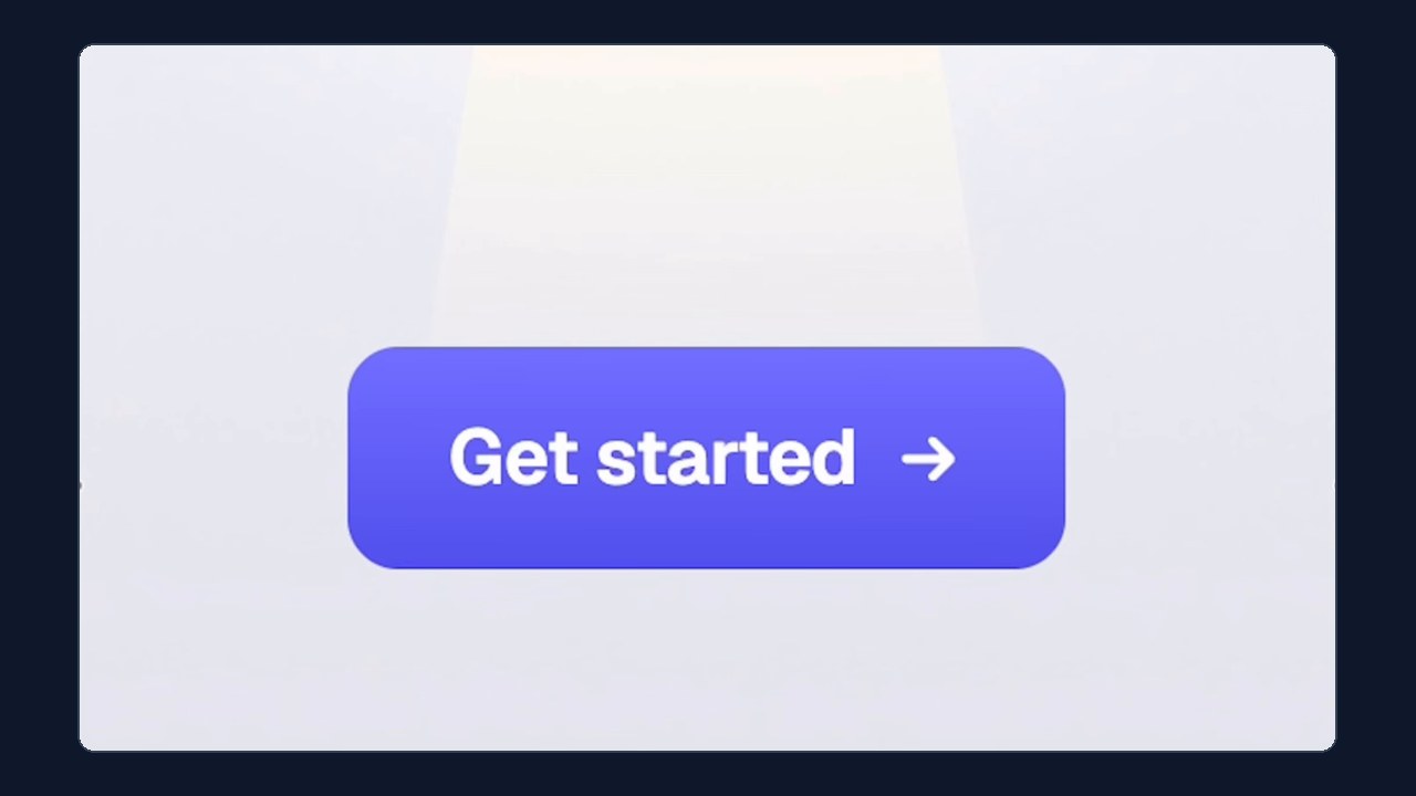
Put your call-to-action button next to one from a premium SaaS site and yours can look flat, even with the **same color and the same corner radius**. The difference is light. Premium buttons look lit from above, and you can fake that with four stacked CSS box shadows, a gentle gradient, and a pressed state that turns the highlight off. It takes a few lines of CSS and works on any site where you can add custom CSS.