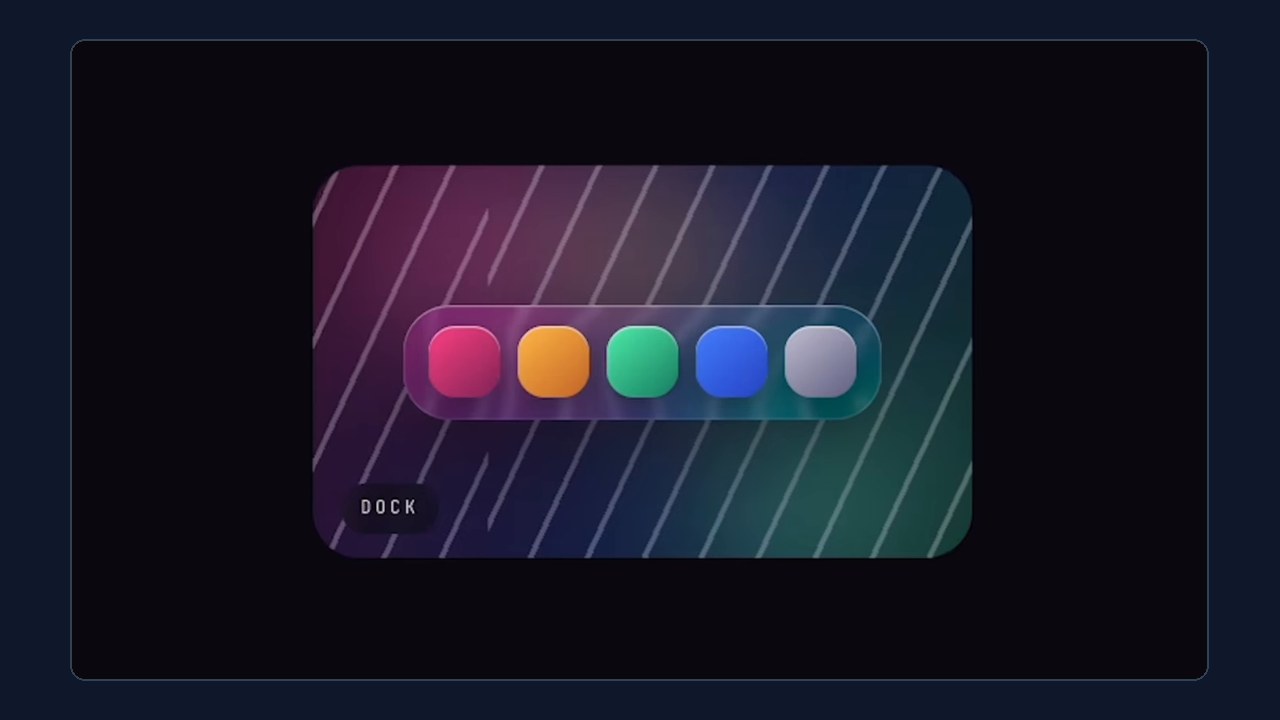
Build Real Frosted Glass in CSS with an SVG Displacement Filter
- Skill level
- Intermediate
- Time to implement
- 30 min
- Cost
- Free
- Platform
- Outcomes
- Saves time
- Last verified
- Nov 14, 2026
Ania Kubow
Original strategy by Ania Kubow. Watch the original on Instagram.
Summary
Everyone is chasing the iOS 26 glass look with backdrop-filter: blur() and wondering why it still looks like a flat gray rectangle. The reason: blur is not glass. Blur averages the pixels behind your panel; real glass bends them. This playbook shows how to add a small SVG filter that warps the backdrop with noise, combine it with your blur, and finish with a lit edge so the panel reads as a physical object with thickness. Great for hero cards, nav bars and pricing panels that need to look premium.
Set upWhat you need
A page where you can add both HTML and CSS (a custom HTML block in your site builder, or your codebase)
A colorful or detailed background behind the panel, since glass effects are invisible over flat color
The MDN backdrop-filter reference for options and browser support
About 30 minutes, including cross-browser testing
Do thisStep by step
- 1
Understand why blur alone looks flat
backdrop-filter: blur()only averages the pixels behind your element, so you get a soft but flat panel. Real glass refracts, so the background should look slightly bent and distorted through it. - 2
Add an SVG filter with a noise texture
Put a hidden SVG on the page containing a
<filter id="lg">. Inside it, use feTurbulence withtype="fractalNoise"to generate a noise texture. Reel Playbooks addition: the reel's exactbaseFrequencyis cut off on screen; start around0.01(lower means larger, smoother waves) and give itresult="n"so the next step can use it. - 3
Displace the backdrop with that noise
Add feDisplacementMap with
in="SourceGraphic"andin2="n"so each backdrop pixel is shoved sideways by the noise. Reel Playbooks addition: the reel'sscalevalue is cut off on screen; try20and adjust. A full starter version:<svg width="0" height="0" style="position:absolute"><filter id="lg"><feTurbulence type="fractalNoise" baseFrequency="0.01" numOctaves="2" result="n"/><feDisplacementMap in="SourceGraphic" in2="n" scale="20" xChannelSelector="R" yChannelSelector="G"/></filter></svg> - 4
Feed the filter into backdrop-filter next to your blur
On your panel, reference the filter in the same declaration as the blur. The reel uses:
backdrop-filter: url(#lg) blur(3px) saturate(180%);withborder-radius: 24pxon a 320 by 200 pixel.glasspanel. - 5
Add a 1px lit edge
Finish with a one pixel white inset highlight so the top edge catches the light:
box-shadow: inset 0 1px 0 #ffffff5c;. That is the step that makes it stop being a div and start reading as an object with thickness. - 6
Test across browsers
Reel Playbooks addition: SVG filters inside
backdrop-filterare not supported in every browser; in our understanding they render mainly in Chromium-based browsers (Chrome, Edge), while Safari and Firefox may ignore the effect. Check the panel in each browser, and if it breaks, keep a plainbackdrop-filter: blur(12px) saturate(180%);version as your fallback.
Heads upCommon mistakes & tips
Background matters. Stripes, gradients or photos behind the panel show off the bend; a flat background hides it.
Reel Playbooks addition: keep the
scalemodest; too much displacement makes text behind or on the panel hard to read.Reel Playbooks addition: check text contrast on top of the glass, since busy backgrounds can drop it below readable levels.
Reel Playbooks addition: backdrop filters can be expensive on low-end phones; avoid stacking many glass panels or animating them.
Reel Playbooks addition: the hidden SVG needs zero size but must stay in the page; do not set it to
display: noneor the filter may stop working.Reel Playbooks addition: using an AI coding tool? Paste this playbook's code and ask it to apply the effect only to one component, then test it in two browsers.
MeasureHow to know it worked
Lines and shapes behind the panel look gently warped and bent, not just softened, and the panel has a bright top edge. Compare it side by side with a blur-only version: the displaced one should look like a pane of glass, while the blur-only one looks like a gray sheet.
ProvenanceSource & adaptation notes
Original
The reel explains that blur is not glass: blur averages the pixels behind a panel while real glass bends them. It shows an SVG filter (id lg) using feTurbulence type fractalNoise and feDisplacementMap with in SourceGraphic and in2 n, fed into backdrop-filter as url() alongside blur(3px) and saturate(180%), on a .glass panel with 24px radius, plus a 1px white inset highlight (#ffffff5c). The caption adds no steps and no written source is linked.
Reel Playbooks additions
Reel Playbooks additions: starting values for baseFrequency and scale (cut off on screen in the reel), a complete starter SVG, the browser support caveat and blur-only fallback, readability, contrast and performance tips, the note about not hiding the SVG with display none, and an AI tool tip. Browser support details are our understanding at the time of writing, not verified across every browser version.
AttributionCredit
Original tip by Ania Kubow (@aniakubow) on Instagram (watch the original reel).
Adapted from @aniakubow's video; steps expanded by Reel Playbooks.
Reel Playbooks credits and links to the original creator. See For creators to request changes or removal.